
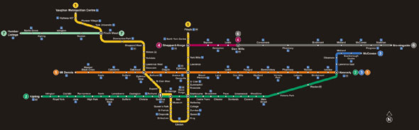
 Toronto's glacial transit expansion passed a major milestone late last week: for the first time in more than a decade, the TTC released an updated version of its subway map. Though it makes assumptions about the Finch and Sheppard LRTs, the updated design includes the Spadina extension and Eglinton-Crosstown for the first time, which feels very exciting indeed and is a perfect excuse to take a peek in the archives.
The Toronto subway map might not be as iconic as London's or as comprehensive as New York City's but it has its own charms. From day one, the TTC has (mostly) stuck to its policy of naming its stations after roads, excluding "avenue," "road," and other suffixes, or landmarks artfully distilled into a single word: "Museum," "Osgoode," "Union."
(Trivia lovers: Main Street is the only station named for a road to retain its suffix. The change was made during construction of the Bloor-Danforth line for clarity, lest some hapless soul think it was the nexus of the subway system. Also, St. Patrick station could have become a neat bookend for Museum station: the TTC briefly toyed with renaming the stop "Art Gallery" in the late 70s.)
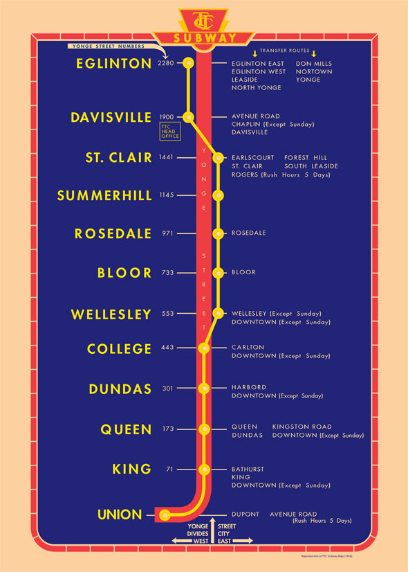
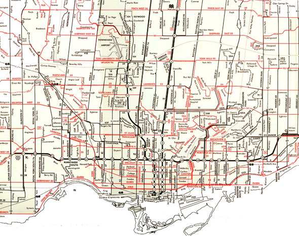
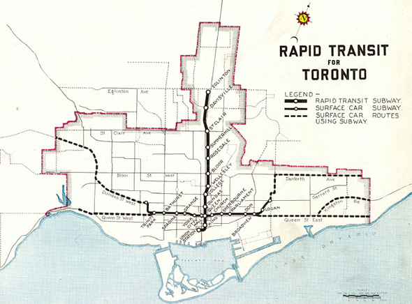
 The first Toronto subway map, shown at the top of the page, borrowed heavily from London Underground, mimicking its style and famous Johnston font. The creator of the famous lettering, the eponymous Edward Johnston, taught Eric Gill, whose own iconic Gill Sans typeface is often confused for the (officially) unnamed TTC font.
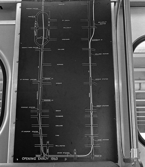
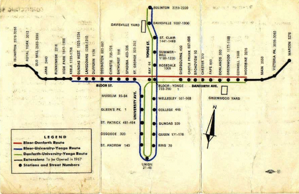
In 1963, with the arrival of the University line, Toronto's first subway expansion, the map was altered and the famous U shape was born, making St. George briefly a terminal station. Things really began to catch fire three years later, in 1966, when the original Bloor-Danforth line brought the first east-west addition to the Toronto subway.
 The Bloor-Danforth line wasn't always marked in green. Early on-board subway maps used red for the Yonge-University line - matching the original red Gloucester trains - from Eglinton to St. George and yellow for subway from Keele to Woodbine, the original kick-off points.
 The Bloor-Danforth line appears to have gone green with its first expansion, which took trains to Islington and Warden - into Etobicoke and Scarborough - in 1968.
By this time the TTC subway had settled on the now-familiar black background design for its rapid transit map. A minor tweak a short time later would remove the gentle curve north after Main Street station in favour of an angular hockey stick sweep.
 The rapid pace of transit expansion continued in the The 1970s. The Yonge-University line was extended to York Mills, then Finch, and the Spadina line opened in 1978, the legacy of a bitter and protracted battle against running a highway from Eglinton down Spadina Avenue.
Minor additions to the subway map appeared with the addition of Kipling and Kennedy stations in 1981, bringing the Bloor-Danforth line to its present state. Plans to run the west end of the track down to Sherway Gardens and possibly to Mississauga would later fizzle.
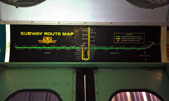
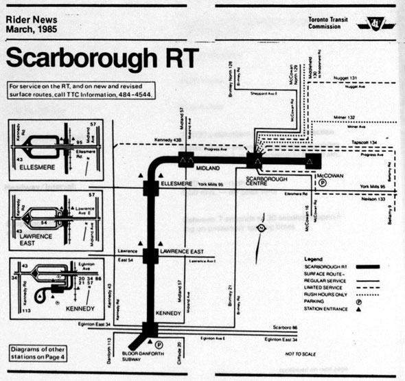 The first new splash of colour to the two-toned map came with the Scarborough RT in 1985, which heralded a slowing of Toronto's once frenetic rapid transit building. Over the next 18 years - more than the time it had taken to dig out tracks under University Avenue and complete and expand the Bloor-Danforth line - the TTC would add only two more stations, North York Centre in 1987 and Downsview in 1996, which resulted in only minor tweaks to the wayfinding material.
(More trivia: North York Centre station is something of an oddity because it was installed between Finch and Sheppard long after the line had opened. The unusually thick support columns between the north and southbound tracks hint at the station's origins as a section of cut-and-cover tunnel.)
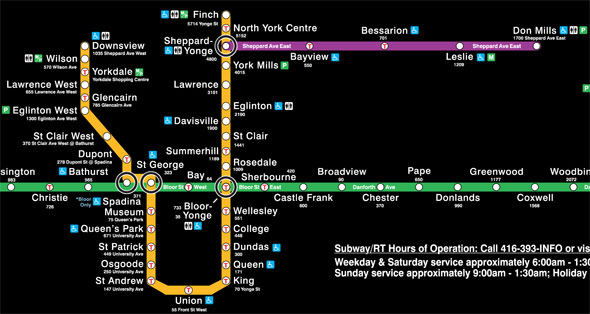
 The most recent map addition came in 2002 with the controversial Sheppard line. Originally intended to bridge the gap between Sheppard and Downsview (the latter built partially in anticipation of the new subway) and continue east to Scarborough Centre, the line was eventually completed to an abbreviated design with the support of PC premier Mike Harris and Toronto mayor Mel Lastman.
Ridership on Sheppard is still drastically lower - less than 10% of the rest of the system.
 And now we move into a new era, one with numbered lines and a rainbow of underground transit. Assuming the new map is built as currently planned (insert lengthy caveats here) the TTC will find itself in charge of 41 new stops - an increase of 65% - within the next decade.
Here's to more rapid transit joining the TTC's 59-year-old map very soon.
 BONUS MAPS:
 It's tempting to picture the Queen subway line, first proposed in 1942, as a missed chance to anticipate the need for a Downtown Relief Line but it was only ever seriously considered as an alternative to the Bloor-Danforth subway. Had it been built as originally conceived, the line would have been designed with streetcars in mind and had stops at City Hall, Grange Park, Spadina, Bathurst, Trinity Park, and Dundas West. Some drawings show it running at grade.
As it happens, City Hall station was roughed in beneath Queen station as a cost-saving exercise but never completed (the shell is behind an anonymous silver door in the walkway between the north and southbound tracks.) When Osgoode station was built in the 1960s, utilities and sewers were diverted to make adding a Queen tunnel easier, but that's as far as the line ever went.
 It's no secret that there is a bona fide abandoned platform beneath Bay station. Lower Bay, as it's come to be known, was built along with a complex (and very expensive) track intersection north of Museum with the idea of running trains directly downtown via Union station from the Bloor-Danforth line.
In fact, that's how the subway ran for about six months in 1966: a passenger waiting at any station could catch a train to any other station without having to change. The system had its downsides, however, particularly for users of Bay station, and was permanently nixed a short time later. Lower Bay is now a film set and occasional relief route during construction.
Chris Bateman is a staff writer at blogTO. Follow him on Twitter at @chrisbateman.
Images: City of Toronto Archives, TTC.
by Chris Bateman via blogTO
No comments:
Post a Comment