We see a lot of transit fantasy maps around these parts, and they're often quite spectacular (if not slightly unrealistic.)
All the pretty colours, all the possibilities... they really are frame-worthy—but so too are modern day maps of the past. Check out artist Jake Berman's website if you need proof.
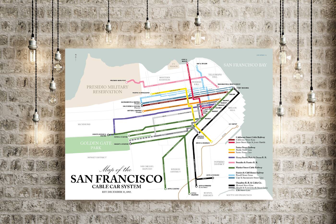
Berman is currently in the midst of a project depicting what he calls "the lost subway and streetcar systems of North America." On his site, you'll find retro maps of the San Francisco's cable cars circa 1892, Atlanta's MARTA system in 1962, the Detroit subway system in 1918 and more.
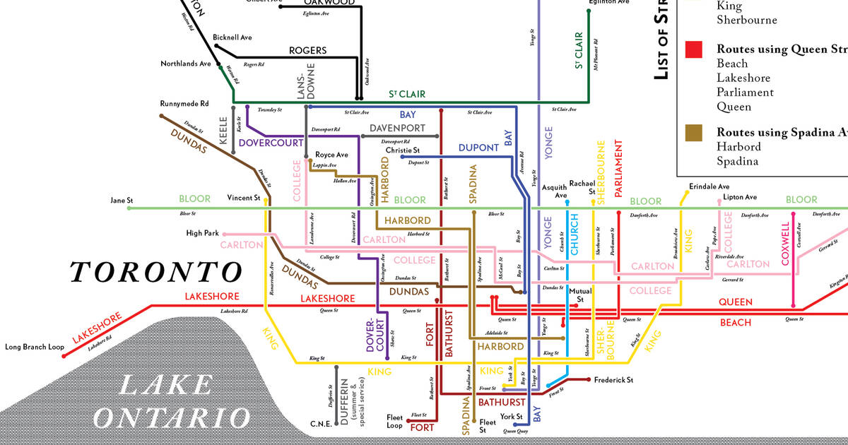
 This week, Berman delighted Reddit with a map of The TTC streetcar network as it looked in 1932.
The design itself is brand new, courtesy of Berman's talent, but the infrastructure is based on a City of Toronto public transit map drawn before World War II.
"I drew a map of the system based on a 1932 original," writes Berman. "It's surprisingly extensive, matching much of what the network looks like now, even though the two busiest lines-- the Yonge-Spadina and Bloor-Danforth lines-- have been replaced with rapid transit lines." He's dead right. Upon first glance, it looks like a much more robust version of the TTC subway system.
The lines represent streetcar routes, of course, but could you imagine if that's what our subway line looked like? Heck, we'd practically be (almost close to even thinking about comparing ourselves to) Paris.
You can learn more about Berman's retro Toronto streetcar map or stylized Toronto subway map by checking out his work right here.
by Lauren O'Neil via blogTO

No comments:
Post a Comment