
Toronto commuters often have no trouble finding something to complain about when it comes to the TTC, and now there's another grievance to add to the list.
Changes made to subway maps around the city sparked outrage not long ago when a bunch of single-line maps started appearing along Line 2.
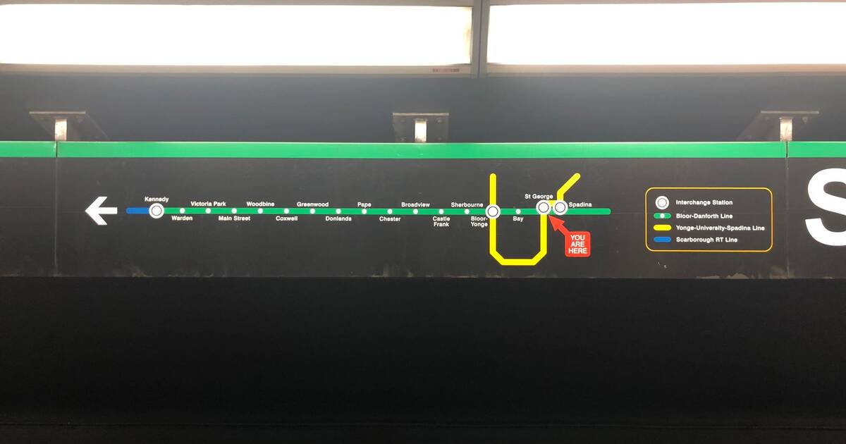
Now, an extra confusing map at St. George station is frustrating residents once again.
The map, which appears wrong at first glance, isn't north-centric.
It shows the subway system from the direction the train is physically traveling, meaning it shows east on the left and west on the right.
And though it does make sense when you understand it properly, it's left Toronto residents puzzled as to why anyone would construct a map this way.
A picture of the map was shared on Reddit with the headline "Why does this city want people to get lost so often?" and many have commented expressing their confusion.
Why does this city want people to get lost so often? from r/toronto
"East is always right, west is always left. Like, on any map. Am I misreading this?" one user commented.
Others have commented trying to explain the map to those who are confused, all while acknowledging that it's not the conventional way of looking at a map.
"It's hard to reconcile that we read left to right and this map implies reading right to left. I get that they're linking this map up with the direction that the train is physically traveling, but as someone who has internalized the TTC, it's a bit jarring," one Reddit user wrote.
"If you're facing the wall, the train will ALWAYS come from your right (except in very limited circumstances), so this map makes sense, but it's a break from the convention I'm used to."
And others are pointing out that, despite the fact that it's not technically incorrect, it's missing an indicator to give commuters some perspective.
"It's not wrong, but it also is a horrible implementation. Assumption on maps is always that east is right and west is left. It isn't wrong to go against that, but you need to at least provide some indicator of where N/E/S/W are," another user wrote.
One Twitter user tweeted a photo of the map back in April, claiming it simply didn't make sense.
This @TTChelps map at St. George station (Line 2 platform heading east) does not make sense. #TTC @TTCStuart pic.twitter.com/jyrXlQuu0m
— Morteza Fadaee (@MortezaFadaee_) April 2, 2019
The TTC Design Twitter account then weighed in with the explanation.
The tweet explains that the map isn't new at all. In fact, it's actually from an experiment from the mid-1990s and was never taken down.
This map is part of a pilot design test evaluating "Heads up" mapping (from the 1990s!). Facing this map - Eastbound (towards Kennedy) is to your left Westbound to your right. It seems backwards but is technically correct. In the end, we decided against this approach.
— TTC Design (@ttcdesign) April 2, 2019
TTC Design's explanation clarifies why these maps aren't showing up in other stations, and it's not difficult to guess why the TTC decided against this method.
Still, until this map is taken down, the confusion is likely to continue.
by Mira Miller via blogTO
No comments:
Post a Comment