
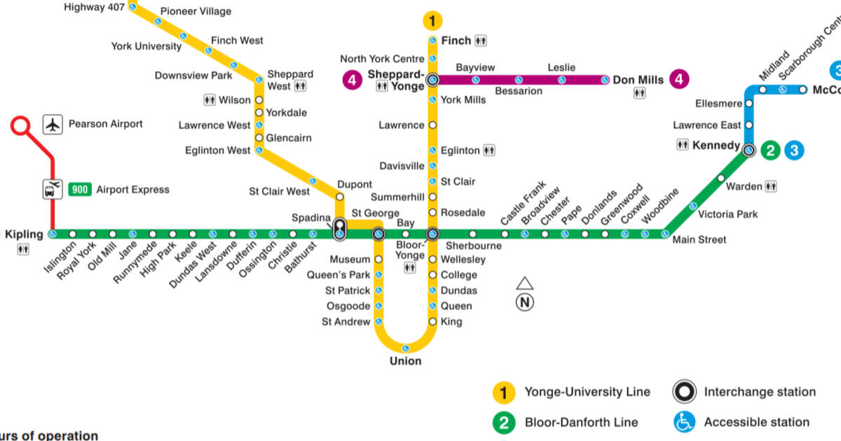
The Toronto subway map might not be as iconic as London's or as comprehensive as New York's, but it has its own charms.
From day one, the TTC has mostly stuck to its policy of naming its stations after roads, excluding avenue, road, and other suffixes, or landmarks artfully distilled into a single word: Museum, Osgoode, Union for examples.
In fact, Main Street is the only station named for a road to retain its suffix. The change was made during construction of the Bloor-Danforth line for clarity, lest some hapless soul think it was the nexus of the subway system.
The first Toronto subway map borrowed heavily from the London Underground mimicking its style and famous Johnston font.
The creator of the famous lettering, the eponymous Edward Johnston, taught Eric Gill, whose own iconic Gill Sans typeface is often confused for the (officially) unnamed TTC font.
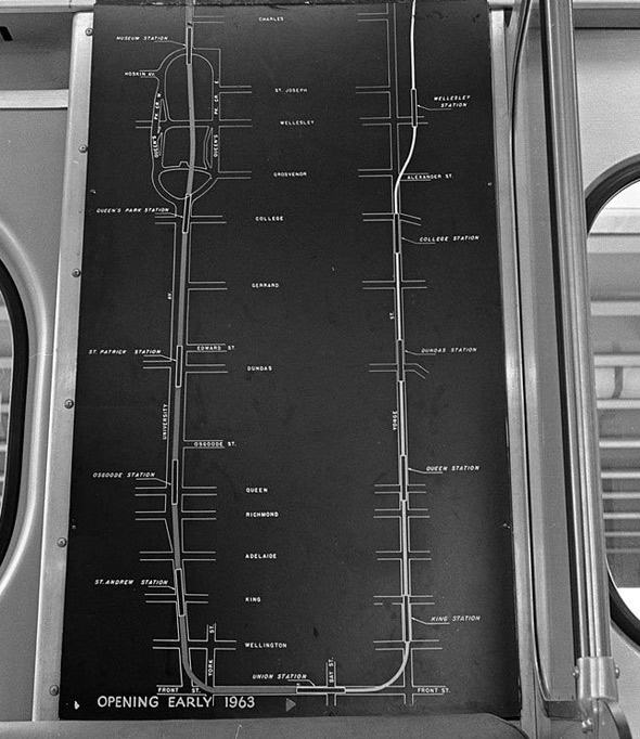
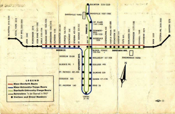
In 1963, with the arrival of the University line, Toronto's first subway expansion, the map was altered and the famous U-shape was born, making St. George briefly a terminal station.
Things really began to catch fire three years later, in 1966, when the original Bloor-Danforth line brought the first east-west addition to the Toronto subway.
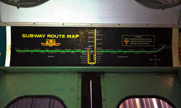
The Bloor-Danforth line wasn't always marked in green. Early on-board subway maps used red for the Yonge-University line—matching the original red Gloucester trains—from Eglinton to St. George, and yellow for subway from Keele to Woodbine, the original kick-off points.
The Bloor-Danforth line appears to have gone green with its first expansion, which took trains to Islington and Warden, into Etobicoke and Scarborough, in 1968.
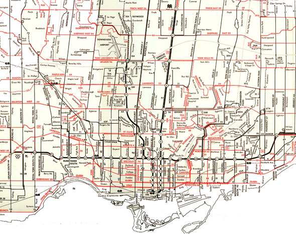
By this time, the TTC subway had settled on the now-familiar black background design for its rapid transit map. A minor tweak a short time later would remove the gentle curve north after Main Street station in favour of an angular hockey stick sweep.
 While the overarching design of the subway map become standardized during this period, there was an intriguing supplemental map that arose which is worth mentioning.
It's no secret that there is a bona fide abandoned platform beneath Bay station. Lower Bay, as it's come to be known, was built along with a complex (and very expensive) track intersection north of Museum with the idea of running trains directly downtown via Union station from the Bloor-Danforth line.
In fact, that's how the subway ran for about six months in 1966: a passenger waiting at any station could catch a train to any other station without having to change. The system had its downsides, however, particularly for users of Bay station, and was permanently nixed a short time later.
The rapid pace of transit expansion continued in the 1970s. The Yonge-University line was extended to York Mills, then Finch, and the Spadina line opened in 1978, the legacy of a bitter and protracted battle against running a highway from Eglinton down Spadina Avenue.
Minor additions to the subway map appeared with the addition of Kipling and Kennedy stations in 1981, bringing the Bloor-Danforth line to its present state. Plans to run the west end of the track down to Sherway Gardens and possibly to Mississauga would later fizzle.
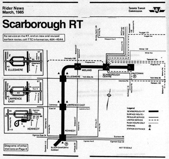
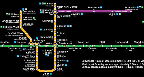
The first new splash of colour to the two-toned map came with the Scarborough RT in 1985, which heralded a slowing of Toronto's once-frenetic rapid transit building.
Over the next 18 years—more than the time it had taken to dig out tracks under University Avenue and complete and expand the Bloor-Danforth line—the TTC would add only two more stations, North York Centre in 1987 and Downsview in 1996, which resulted in only minor tweaks to the wayfinding material.
Incidentally, North York Centre station is something of an oddity because it was installed between Finch and Sheppard long after the line had opened.
The unusually thick support columns between the north and southbound tracks hint at the station's origins as a section of cut-and-cover tunnel.
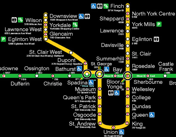
Finally in 2002, the controversial Sheppard line opened. Originally intended to link Sheppard and Downsview (the latter built partially in anticipation of the new subway) and continue east to Scarborough Centre, the line was eventually completed to an abbreviated design.
And now we move into a new era, one with numbered lines and a rainbow of underground transit.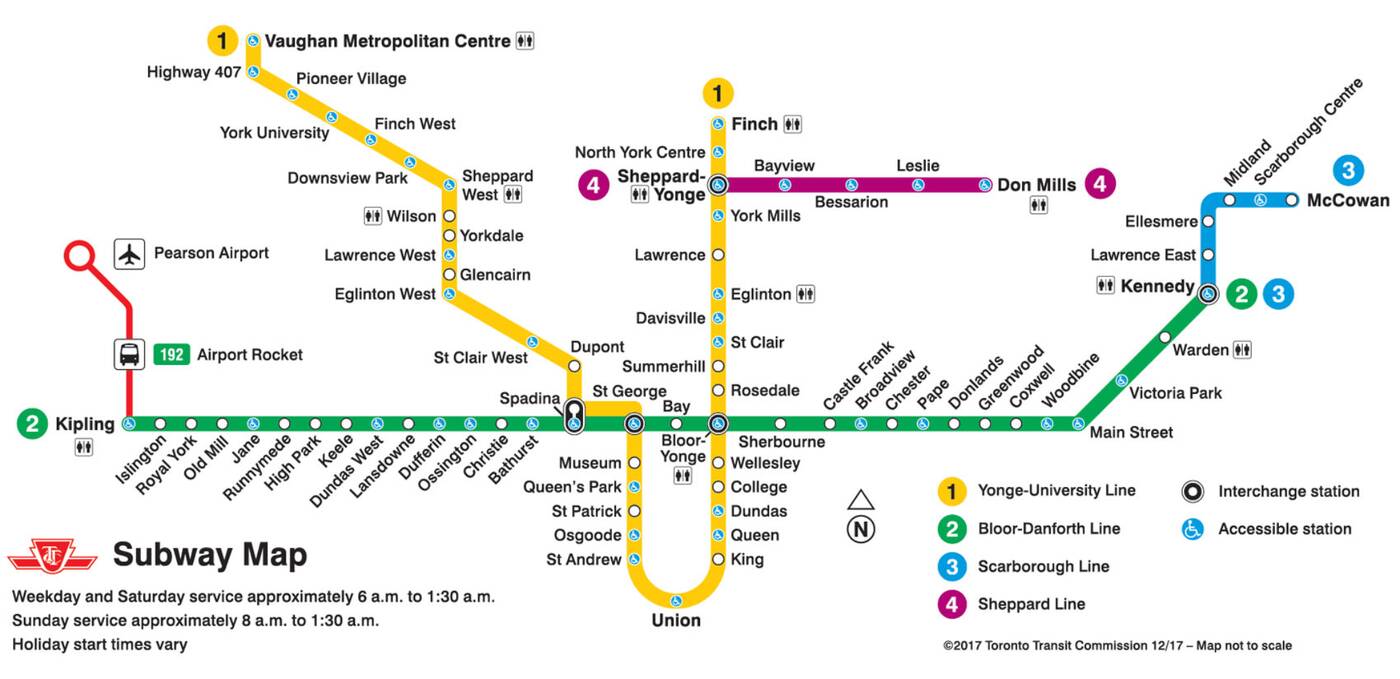 The most recent addition to the subway map is of course the addition of the Toronto-York Spadina Subway Extension in December 2017. It extends the line from the former Downsview station (now renamed to Sheppard West) up to Vaughan Metropolitan Centre.
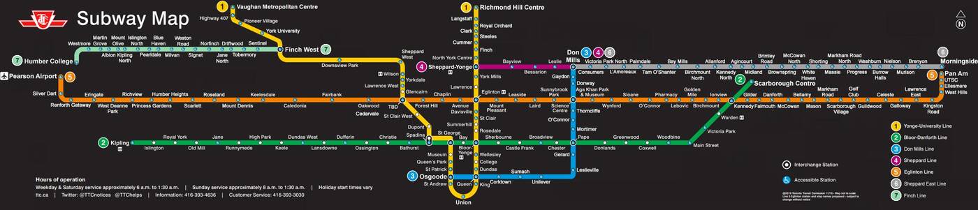 But, the future of the map is set to change in the coming decades.
At a minimum, we'll see the addition of the Crosstown LRT, though the one-stop Scarborough Subway Extension and the Finch West LRT should ideally be on the map by the next decade as well.


by Staff via blogTO
No comments:
Post a Comment