Another day, another complaint about the TTC. But this time it's not about delays, shut-downs, windows or bed bugs.
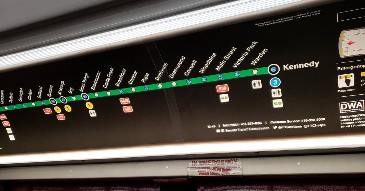
This time, people are mad about the TTC's new single-line subway maps.
I question the decision to supply only a portion of the map on @TTC subway cars... no full system maps to be seen. Why the #downgrade? pic.twitter.com/7LYYkhN6fJ
— Shimrah (@shimrah) August 19, 2019
The maps can currently be seen in certain subway cars, and they only show one line instead of the whole system.
"I really hope this is as part of a trial or some testing... Terrible design. It provides no sense of direction and it lacks the other lines!," one Twitter user wrote of the map online.
Passengers seem to be pretty confused by the decision to exclude the other lines from the new maps, and many are wondering how those who don't know the system off by heart will know to transfer lines if need be.
Everyone: "Hey #TTC, it'd be great if busses were on time sometimes, or if subways weren't constantly delayed."
— Mike D 💡 (@mikedipaul) August 14, 2019
TTC: "Let's throw out transit map design principles for some reason... you're riding the stick line. Where else can you go? 🤷♂️ Good luck planning your ride!" pic.twitter.com/v70MCNVOiq
Some are saying the maps specifically disadvantage tourists and newcomers who don't already have an understanding of Toronto's transit system.
.@TTChelps I think your new maps which show only one line do a disservice to tourists and newcomers looking to understand our transit system and plan their route. For example: How would someone who wanted to get off at Museum know where to go if they saw this? #ttc #Toronto pic.twitter.com/Zn6WGrvNRR
— Harrison Lowman (@harrisonlowman) August 20, 2019
The TTC's Customer Service Twitter account has replied to some of the online complaints, stating that the single-line maps are not standalone.
The TTC said the maps are accompanied by the Ride Guide Lite — which includes a full system map — hanging by the train doors. They said full subway and streetcar maps are also located in frames next to trains.
"Subway + Streetcar Map isn't always present in the same car, and Ride Guide Lite = paper waste (and also not always present). A commitment to having the Subway + Streetcar Map on every car would make this strategy more effective," one Twitter user replied.
Although the TTC said there are still full-system maps readily available, Toronto subway riders just can't seem to find them.
Agreed. Is there a plan to include full system maps in additional to these, @TTChelps? Because at the moment, this doesn't appear to be the case (which makes trip planning more difficult...) #toronto #transit @blogTO https://t.co/WbTUkyyHAh
— johnny craps (@effectwarming) August 19, 2019
In response to another online complaint, the TTC said the simple design of the map makes them more accessible.
"It's a simpler design with better accessibility (larger type, reduced complexity and clearer symbols). It's also following best practices from other transit systems around the world, familiar for travellers and visitors to the city," the transit agency wrote.
But once again, commuters seem to disagree.
I've not seen the full-system #TTC map in frame that you speak of, only this one-line uselessness. #designfail Cannot possibly see how this falls under "best practices".
— Tina McCulloch (@tmccull603) August 20, 2019
While it's clear that the intention behind these maps was to make things easier for passengers, Toronto seems to think they do the absolute opposite.
by Mira Miller via blogTO

No comments:
Post a Comment