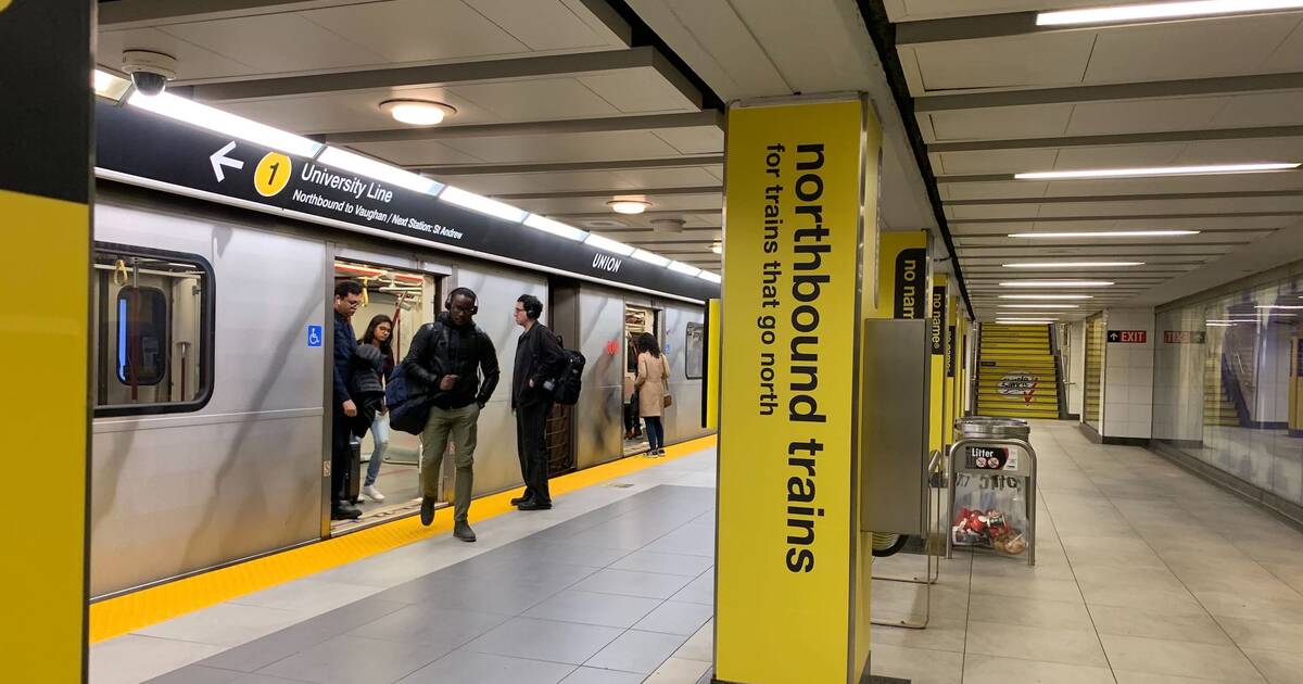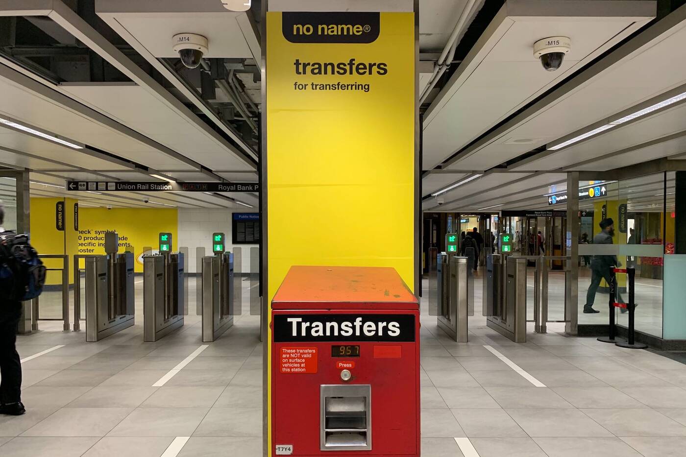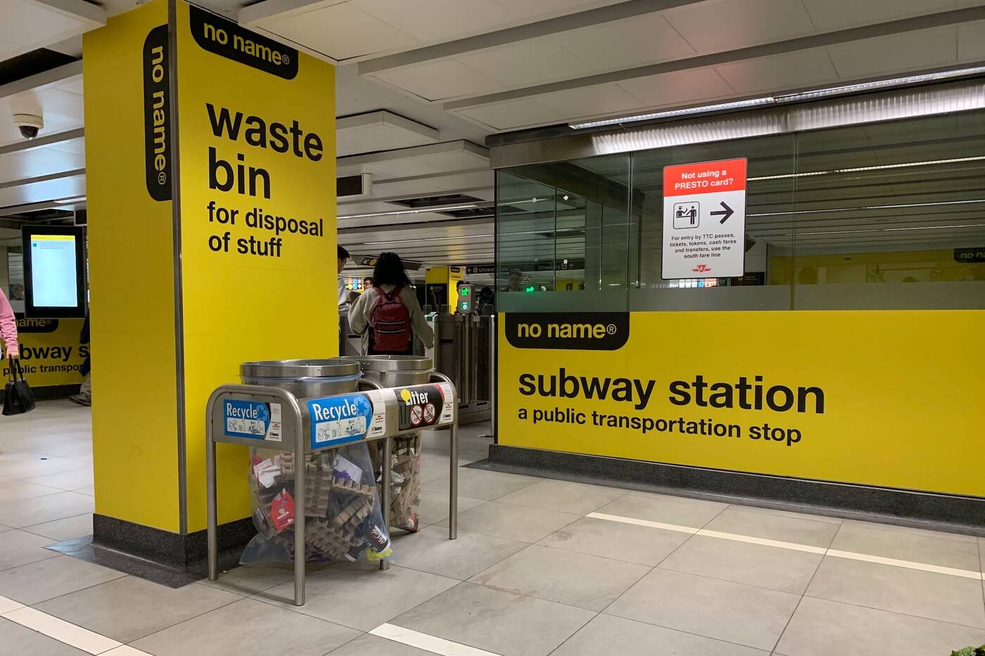
No Name brand's familiar black and yellow branding is getting ever more pervasive in Toronto. At this point, it's taken over everything from beer to the sides of buildings to streetwear to video games.
Now, they're coming for our subway stations.

A transfer station given the No Name treatment. Photo by Aaron Navarro.
The cheery shade of yellow is currently brightening up Union Station, common features of the TTC given classic tongue-in-cheek no-frills labelling. There's a "subway platform (with assorted commuters and trains)," "transfers (for transferring)" and at least one "waste bin (for disposal of stuff."
Of course, the brand installation has blown up on Reddit, commenters applauding the staying power of the steadfast minimalist style of No Name (while, of course, hastening to disclaim they rarely buy such low-quality processed products).

Union Station is entirely covered in the yellow and black No Name branding. Photo by Aaron Navarro.
Other commenters worry marketing on such a massive scale is contradictory to their no-frills low pricing model, while some complain the branding has been tainted over the years unneccessary add-ons to the graphics and overly gimmicky copywriting.
Whatever your opinions on the brand itself, this latest marketing strategy has certainly been eye-catching, and relatively entertaining. There's no doubt that a marketing campaign taking over an entire TTC station gets Toronto's attention.
by Amy Carlberg via blogTO

No comments:
Post a Comment